

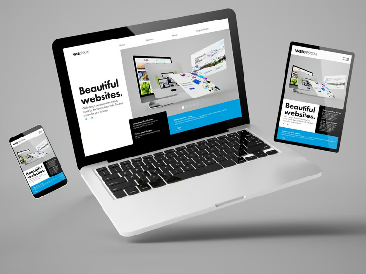
Responsive Website Development
We transform your ideas into websites that automatically adjust to every
screen size, whether it’s a desktop, tablet, or smartphone. With responsive website development, your business
not only gets an elegant look but also a seamless user experience that keeps your visitors engaged.
Our expert team ensures that your website loads faster, looks sharp, and works flawlessly across all
devices. Using modern frameworks like Bootstrap, Tailwind CSS, Angular, React, and advanced CSS media
queries, we craft websites that are future-proof, mobile-friendly, and SEO-optimized.
A responsive website not only improves user experience but also boosts your search rankings, widens your reach,
and increases conversions, ensuring your business stays ahead in the digital race. With just one website that
adapts everywhere, you save time, reduce costs, and deliver consistency across all platforms.
At DNG Web Developers, we combine creativity, technology, and strategy to build responsive websites that leave
a lasting impression and give your brand the professional edge it deserves.
Key Benefits & What You Get From It
- Seamless User Experience (UX):Provides an optimal viewing experience—easy reading and navigation without resizing, panning, or scrolling horizontally. This leads to higher user satisfaction.
- Accessibility: Makes your site accessible to everyone, regardless of the device they use. Users are more likely to stay and engage.
- Consistent Look and Feel:Maintains a consistent brand identity and user journey across all devices, building trust and familiarity.
- Increased Mobile Traffic Conversion:With most web traffic coming from mobile, a responsive site is crucial for converting visitors into customers, leads, or subscribers.
- Easier and Cheaper to Manage:You only have one website to manage, update, and maintain. This is far more efficient than running two separate sites for desktop and mobile (which was the old way).
- Improved Analytics: With a single site, your web analytics are consolidated into one report, giving you a clearer picture of user behavior across all devices.
The Future: Beyond Responsive Design
While responsive design ensures your website works on any screen, the future lies in creating experiences that adapt
to the user's context, environment, and capabilities. This next evolution moves beyond the viewport to embrace
AI-powered layouts that intelligently reorganize content, voice and conversational interfaces, and immersive WebAR
experiences that overlay digital information onto the real world—all directly within the browser.
Furthermore, the most crucial advancement is adaptive accessibility. The modern web automatically responds to user
preferences set at the operating system level, seamlessly switching to dark mode, reducing motion for those with
vestibular disorders, or increasing contrast for improved readability. This shift means building not just for screen
size, but for a more intuitive, inclusive, and context-aware web for every user.